Necronomicon 2024
T-shirt Design Essay


Some thoughts on how to design a Necronomicon T-shirt

Over the years, Necronomicon has always turned to non-professionals for the design of our convention t-shirts. Some Cons, who have artist Guests of Honor, will ask or require them to create a design. While this undoubtedly ends up with better artwork, we don't always have an artist GoH to turn to.

So for many years, we've had a contest to come up with the design. I've been a member of the club since before the first Necronomicon, and I've had 13 designs used on the shirt. This is partially due to the fact that in some years, we've had very few entries. However the last 15 years have seen some good ones. This page is an essay on what it takes to make a good Necronomicon t-shirt design.

If you are interested in creating a design for consideration, I highly advise you to read this page. Actually, I'd like you to look at THIS page first. It is the T-Shirt History page and has a sample of all the shirts done each year. This essay will be talking about them, and what will and won't work on a design.

In the first few years, we did silk-screening of the shirts ourselves. This was cheap and semi-easy. Mostly cheap. The design was usually hand drawn and then transferred to the stencil to be prepared. We had to keep our lines thick, and the design basic. Around 1986 we started using a shirt printing company that we are still with. They have helped us do a good job on the designs, and understand what we need.

I mentioned that we didn't use professional artists, and actually that is not totally true. In 1985, Kenny Mitchroney, a local Fan artist did the design for us. Kenny went on to be an animator on Tiny Toons, and Toy Story 2. In 1986, Ingrid Nelsen did a design for us that was well received. 1988 saw Jon Bortels submit a design unsolicited that was very good. In 1997, Ben McSweeney, then an art student, created a design that blew the competition away. He also did the years, '98, '99, 2000 and 2002. He is NOW a professional artist, and gets paid to produce the type work he did free for us.

I started submitting designs seriously after the dreaded 1990 design. That year, we had no entries. None. In order to have a t-shirt that year, we came up with the "property of " design. I didn't want to see that happen again, so I created one for the 10th anniversary year.

So, here's my opinion on what it takes to make a good t-shirt design. First, you have to know that we've found that black t-shirts sell much better than any other color of shirt. It's currently our policy that the shirt must be black. When you are creating your design, keep this in mind, and work on a black background if you can. I will also confess that other than the 1982 design, all of mine have been done on a computer. 1991 to 1996 were done on Drawperfect 3.1 and from 2001 on, in Photoshop. You will of course have to work with your medium of choice, but it will be converted to a TIF file for the printer before we are done. So, if you start electronically, you will be more flexible for adjustments later.

When doing a design, you should know that you can use different colors to create your image, but you can't get photo-realistic in your design. Things like shading, half tones and such just will not reproduce well. Stick with solid line art in no more then 4 colors max. (i.e. 2003 Skulls) {ok, 2001 used 5 colors). Standard colors work best, but you can do others too. 2006 used an Ocher color in the design.

Line thickness is also a factor. Your lines should not be smaller than 1 mm, or else they may be broken, or incomplete. If the lines are supposed to fade at that point, then fine. But keep this limitation in mind.

Quantity of coverage can be an issue too. We've found that if there is a lot of ink over a large area, it makes the shirt hot and you sweat under the design. Ben and I agreed, after the fact, that the retro future shirt of 2002 had too much white area. Those could have been done as shaded or outlined and it would have worked better. This concept was in my mind as I did the 2006 design. The rays from the top are done in jagged lines to limit the paint covering the shirt.
<-how it was------how it should have been-
All designs must have the name Necronomicon and the year in it. This year should be rendered as 2024, not '24. Using the Necro Glyph somewhere in the design is suggested too, but it's not required. You can download a zip file with the glyph in it from here.

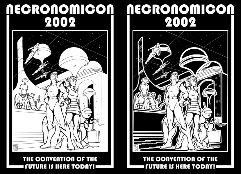
Click the image to download a 1.2mb zip file that contains:
One layered, Photoshop 7 .PSD file, 1600x1600 in 200dpi, 1.5mb
One 1600 x 1600 200dpi .JPG file white on black, 740K
One 1600 x 1600 200dpi .JPG file black on white, 740K

For a number of years, the program book has been written with a "theme" in mind. Mostly to keep the writers from getting bored and submitting the same program book, year after year. The Convention itself has sometimes reflected this theme in other ways. While the T-shirt design does not HAVE to follow the theme, it has on a number of years. (1996 to present).

In 2024, the program book theme is: ALIENS! What's that mean? Well, it may be up to you. We done't mean just Xenomorphs, but any type of alien. Strange Visitors; Invaders; Grays; reto-Bug eyed monsters; Whatevery strikes your fancy.

If you are working electronically, I'd suggest about 300dpi for your work. Width of the design should be about 11-12 inches. Height can be taller. You can submit your entries to me at: jomark@stonehill.org in .jpg format. I'll print them on a color laser for submission and judging. If yours is chosen, I'll contact you about getting a higher resolution version for the printer. (Note, they like a single image file for each color layer, with registration marks for alignment. So don't flatten all your layers if you can help it. )

If you are sending in hand drawn work; that's perfectly fine. We can scan it and electronically separate the layers.

In a lot of ways, you have to think of the design more as a logo than a work of art. It both advertises the convention, and hopefully has a captivating image. We take all submissions and vote on them at our club meeting. I highly encourage you, the artist reading this, to try your hand, and send in a submission. Hopefully, I've shed some light on this process. Thanks, and I look forward to seeing what you can do!

Mark Jones


Necro Home Necro News  Join Us   Hotel   Guests   Dealers   Gaming
Art Show   Schedule   Charities   History   Contact Us   Site Map  

Master Page  Stone Hill   Necronomicon  Southern Media Con  Links